
How to use colour
We are surrounded by colour; both man-made colours and colours in nature. From the trees to the red-orange brick wall, to blue-violet flowers, artworks and photographs on our walls. Some colours command attention and some are quiet and reserved.
We all have our colour preferences, and our perception and relationship to colour is rooted in personal experiences, physiology, and psychology.
Creating harmonious colour palette, whether for painting, home decor, fashion or cake decorating can seem daunting. Figuring out what colours to pair, how to mix a certain shade, what colours to add and omit can be difficult.
However, there are simple ways to create colour schemes that are harmonious and beautiful.
CREATING HARMONIOUS COLOURS
To create harmonious colours, we will make reference to the colour wheel (an artist’s fav companion)
There is no colour without light. Light is an electromagnetic energy measured in wavelengths, and and our eyes are only sensitive to a narrow range of wavelengths. The range of colours that we can see is known as the visible light spectrum (VLS). Visible light is made up of the colours of the rainbow (Red, Orange, Yellow, Green, Blue, Violet), and all the colour merge to create what our eyes perceive as white light.
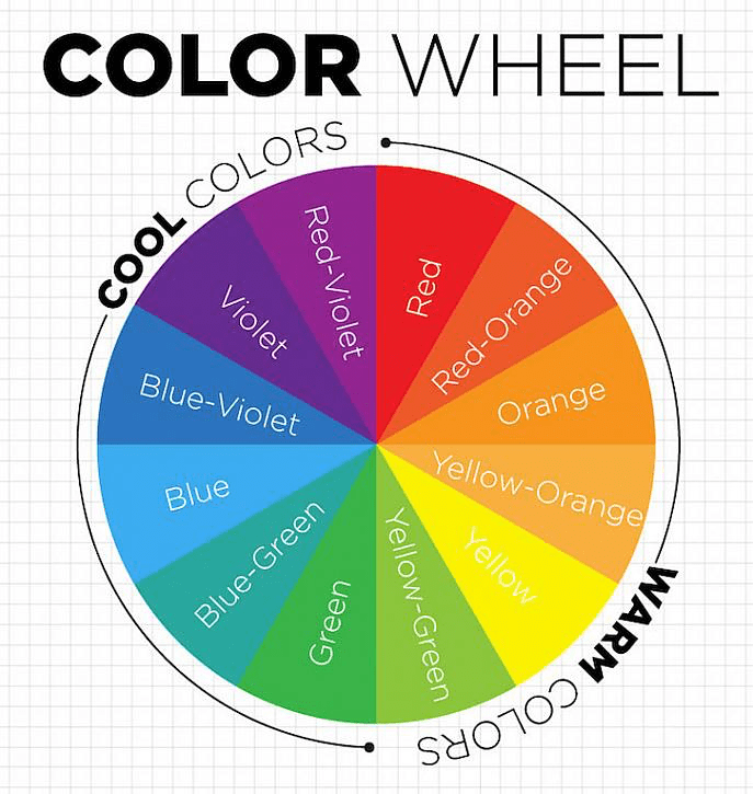
The colour wheel shows the colours of light in their respective positions in a circular form making it easier to use and interpret colours.
ANALOGOUS COLOURS
Analogous colours are colours that lie adjacent to each other on the colour wheel. Usually consisting of 3-5 colours. For example, a colour palette of Red, Red-Orange, Orange, is considered an analogous colour.
These colours are inherently harmonious because the emit the same wavelength of light. Images and designs that are analogous usually feel calm and cohesive.
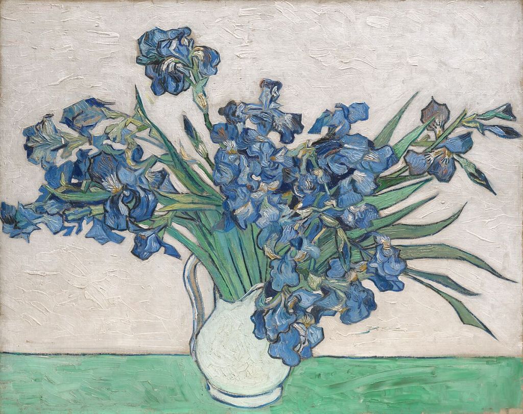
This painting by Vincent Van Gogh of Irises uses an analogous colour scheme. Mainly consisting of Blue-green, Green, and Blue-Violets.
Analogous hues should go beyond one colour but include colours that share the same hue.
COMPLEMENTARY COLOURS
Complementary colour lie opposite each other on the colour will. The complement of red is green, complement of yellow is purple, and complement of blue is orange.
When placed next to each other, the contrast between the two hues generates visual energy and excitement.
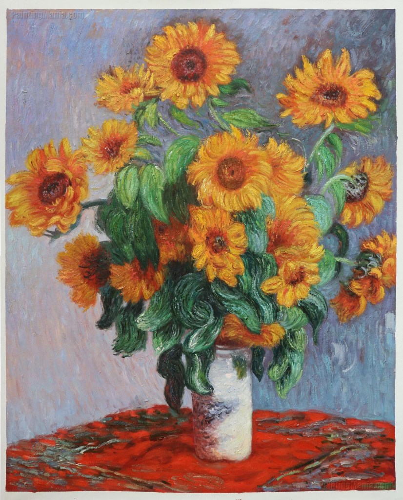
The painting by Monet (above) uses a complementary colour scheme. the yellow sunflowers contrasting with the purple walls, and the green leaves contrasting with the red table cloth.
This create a bolder more exciting image.
MONOCHROMATIC COLOURS
Monochromatic colours uses colour of the same hues. This is a simple way to start harmonizing colours. However, to prevent a flat image or scene, the be sure to manipulate the value and saturation. Some colours can be muted and some saturated, some darker or light in value to create contrast.
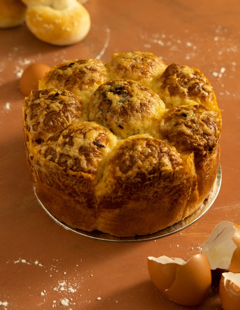
The image above uses a monochromatic colour scheme, consisting of mostly browns- a yellow brown with variations in value (the luminosity of a colour) to create contrast.
There are other ways to create harmonious colours and you would start to notice the nuances and subtle differences once you embrace colour.
Remember, what looks beautiful, truly beautiful is always right. Trust your eyes!
Chisom
